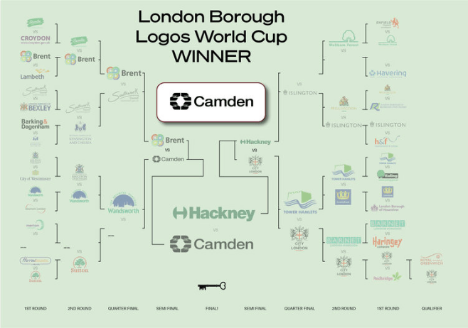
Camden has triumphed in the London Boroughs Logo World Cup after its signature emblem depicting four pairs of linked hands saw off Hackney in a hotly contested final.
The charity Open City (OC) hosted the competition, which featured 33 London municipality logos and accumulated up to 40,000 votes on various Twitter polls from February 22 to March 4.
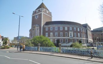
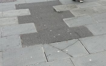
OC programmes and communities manager Rhea Martin said: “We’re all quite used to associating the graphic identity of the London Boroughs with mundanity. We tend to see them on the sides of bins, or street signs.
“The World Cup was an opportunity to look at them without that context and evaluate them as a piece of design in their own right – something that is perhaps more difficult to do on the street.”
In the knock-out style event, Camden saw off the colourful logo of Brent in the semi-final before beating Hackney in the final by gaining 54 per cent of the total 2,947 votes cast (1,580 votes).
🎉 @CamdenCouncil logo wins #BoroughLogosWorldCup! Some have called it ‘the elephant’s foot’ but we know it represents standing together as a community.
Thanks to @openhouselondon & @hackneycouncil for helping us celebrate local govt! https://t.co/a6lFycqjPe
— Georgia Gould (@Georgia_Gould) March 4, 2021
The City of London comfortably defeated Brent in the third-place playoff with 63 per cent of the votes to make up the rest of the podium.
Although not officially a borough, the City of London was allowed a spot in the competition after beating the Royal Borough of Greenwich in a preliminary round to form the 32 places.
Martin said: “Camden’s design is a classic, and a lot of us in the office are fond of it. It’s one that appears simple but reveals more the closer you look at it.
“A lot of people seemed to realise for the first time that it was made up of clasping hands, so might look at it a little differently from now on.”
Kingston had managed to fend off the City of Westminster in the first round before being unceremoniously dumped from the competition by Wandsworth in the next, obtaining only 44 per cent of the votes.
Big Response
Overall there were 33 polls that lasted 24 hours each, running across the 10 days.
Each poll had an average of 1,208 votes in total with the final nearly breaking 3,000 votes.
Martin said that the huge response and number of people voting was a “testament to Londoners’ enthusiasm for the city and the places they live”.
Many took to Twitter to praise the “silliest of tournaments”. One user said: “I’ve enjoyed this, but slightly disappointed that the final two are so damn tasteful.”
Several councillors and official borough council Twitter pages also engaged with the competition and campaigned heartily for their logos to win.
Martin said: “I would argue that a lot of voting took place based on local allegiance rather than purely aesthetic merit, and we often saw people torn between the borough they grew up in and the one they live in now.”
Voting Trends
Both Camden and Hackney are original designs from the 1960s with the Camden logo, designed by Wolff and Partners, standing for unity and community, explored through the symbolism of clasping hands.
The ‘H’ design for Hackney had previously proved so popular that Nike was forced to apologise and settle outside of court back in 2006 over a copyright dispute with Hackney Council when Nike used the logo on a t-shirt design.
The Camden logo accumulated the second largest number of votes out of all the polls with 1,580 but Sutton obtained the most in their first-round win over Harrow with 2,036 votes.
However, Sutton failed to make the strong start count when they lost in the next round to Camden garnering less than 250 votes in the unpredictable tournament.
Redbridge was the unfortunate recipient of the least amount of votes in a single round obtaining just 114 votes on the way to a first-round defeat by the City of London.
Martin said: “We were really impressed with the level of engagement across the board.
“Personally I was a little surprised that some of the ones with traditional crests got so far, and Camden was almost knocked out by Bromley right before the final.”
Linus Boman, a graphic designer who specialises in lettering and branding, made a Youtube video that attempted to rank every borough logo from best to worst based on certain criteria.
The criteria he utilised measured the logos on five aspects; suitability, ownabiltiy, longevity, typography and execution.
According to this criteria, the Lambeth, Islington and Hackney logos came out joint top but in the Logo World Cup Lambeth failed to get past the first round whilst Islington lost to Hackney in the quarter-final.
Conversely, Linus ranked the logos of Harrow, Barking & Dagenham and Newham as the worst logos which was also reflected in the Logo World Cup, with all three losing in the first round of matches.
Camden, on the other hand, only mustered a joint sixth finish according to Bonham’s scale.
What about you? Did you think Camden were deserved winners or do you think there is a better logo? Have your say on this poll below:

